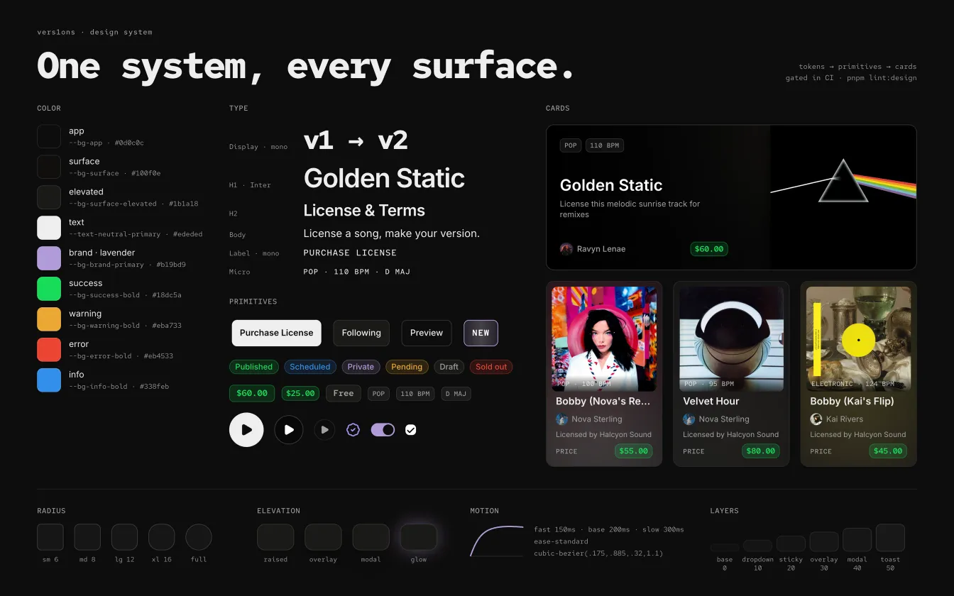
One cohesive product
- ready · press run, or hover any part of the system
Problem
The app looked like it was built by a different team every week.
vers1ons grew screen by screen. There were seven different status badges, a dozen hand-built play buttons and prices in three different greens. Orange and pink accents competed with the brand, and none of it said who we were. The app didn’t feel cohesive, and it felt amateur.
Fixes didn’t stick either. A color changed in one place stayed wrong in ten others, and every new screen started from scratch. For a product asking labels and artists to trust it with their music, looking unfinished was a real cost.
What I did
I designed the system and moved the whole app onto it.
I set the visual direction. Dark only, warm black surfaces so cover art stands out, lavender for the brand and actions, and green only for money, so the price is always the thing you can find. Inter for words, Red Hat Mono for data like prices, BPM and dates.
Underneath, I built the tokens and the shared components, like the play button, the price pill and one status badge in place of seven. I redesigned Discover on them, and moved the rest of the app across in five waves, from the shell and wizards to the player and the smaller apps around it. Then I made it hold. A design check in CI blocks off-system colors, layering and motion, and a mobile spec builds touch sizes into the components themselves.
I designed or shaped most of the app’s UI along the way, including the cards in use today. The team helped build them.
Piece by piece
8 steps, one screen at a time.
01Color means somethingLavender is the brand, the actions and focus. Green is only ever money, so the price is the thing you can always find. Everything else steps back on warm black, so the cover art leads. 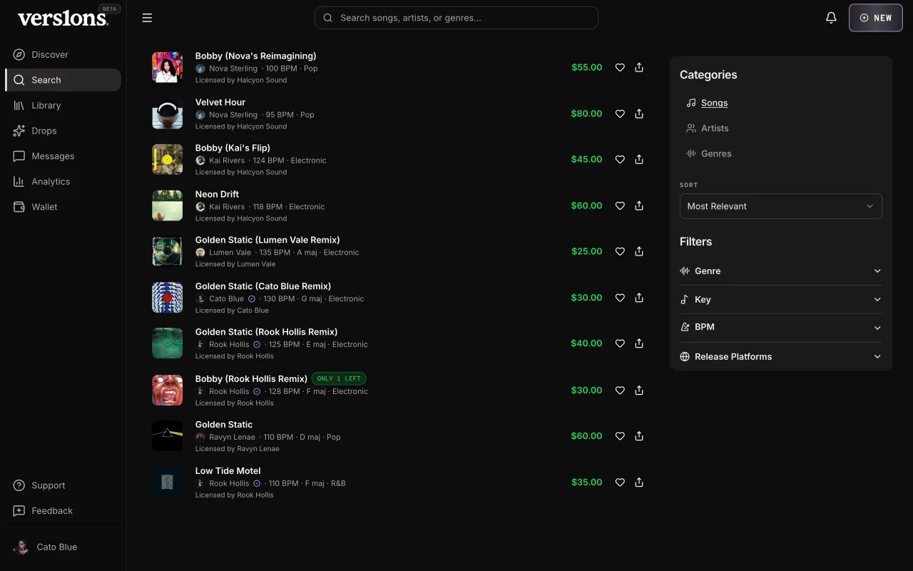
02Words and dataInter for words, Red Hat Mono for data. Prices, BPM, keys and dates line up in columns and read as numbers, while titles and copy stay easy to read. 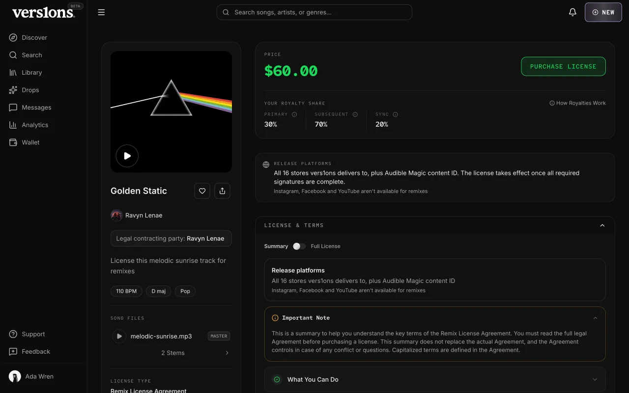
03Shared partsOne play button, one price pill, one status badge, one section header. Each replaced several hand-built copies, so a change in one place shows up everywhere. 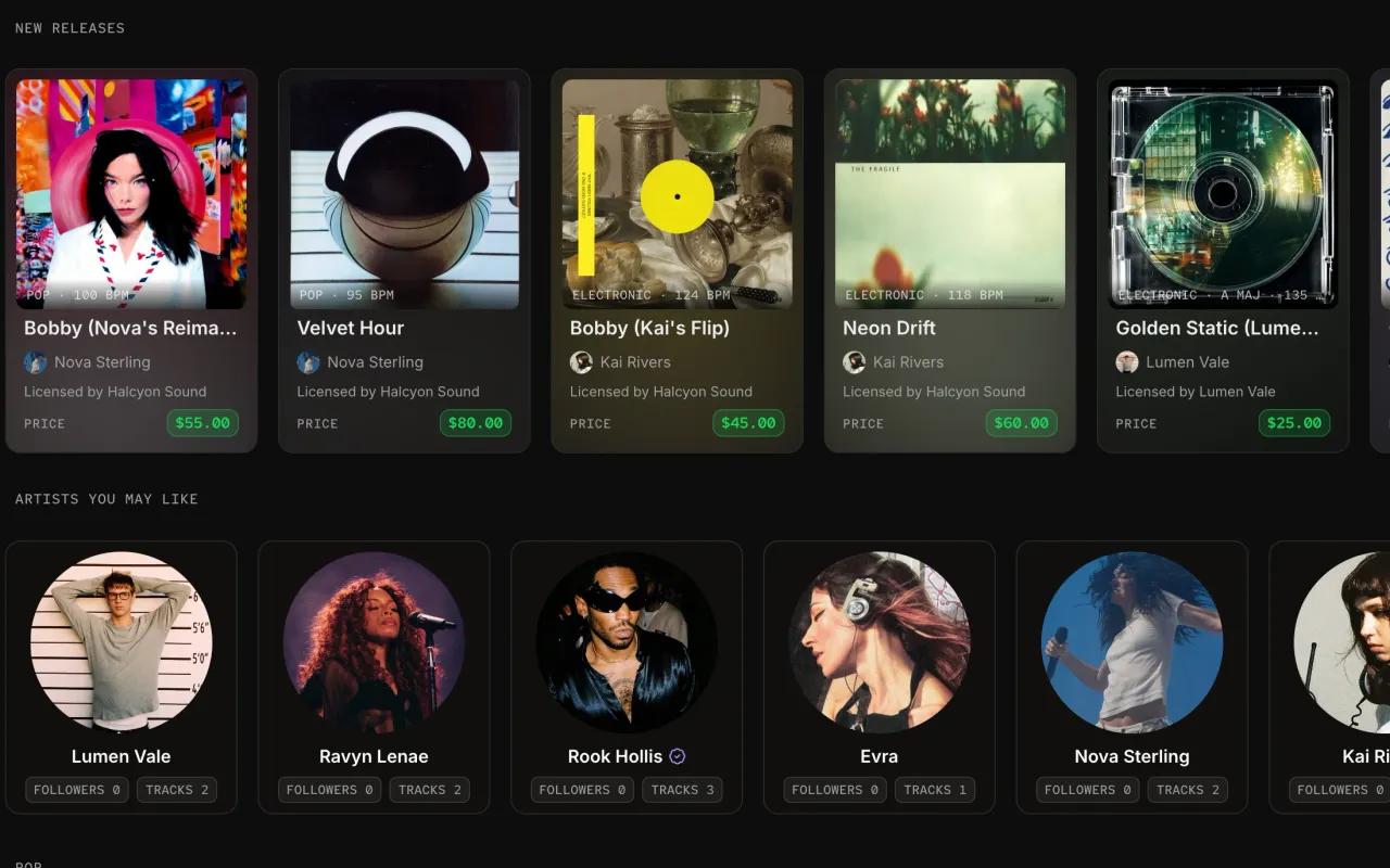
04The card familyListing, featured, compact, artist, genre, purchase and drop cards all follow the same rules. The price is always the same pill, play always sits on the art, and every card lifts the same way on hover. 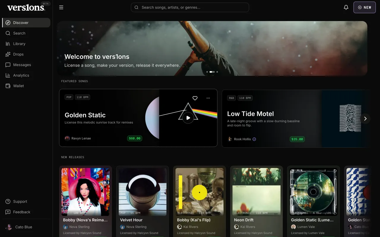
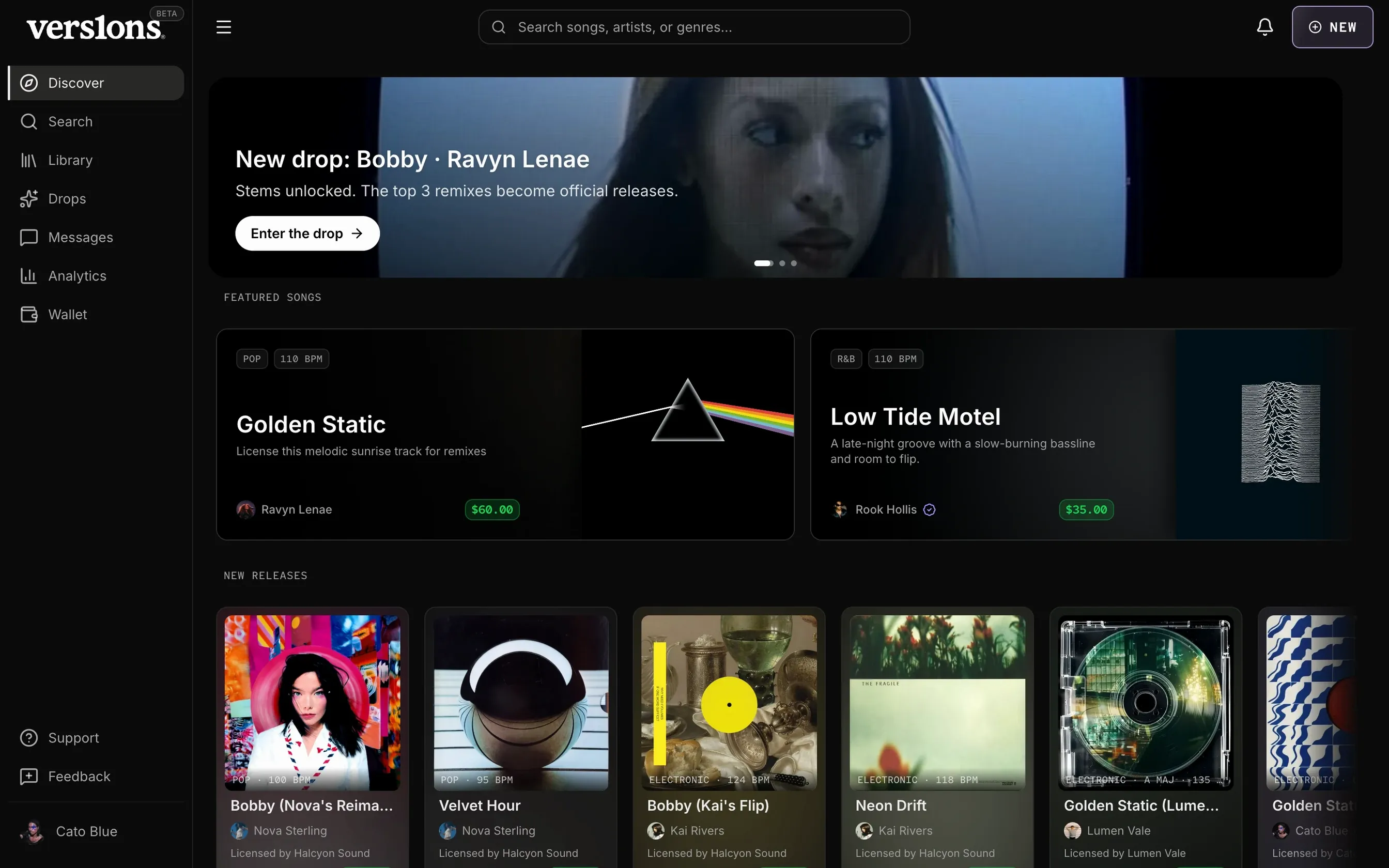
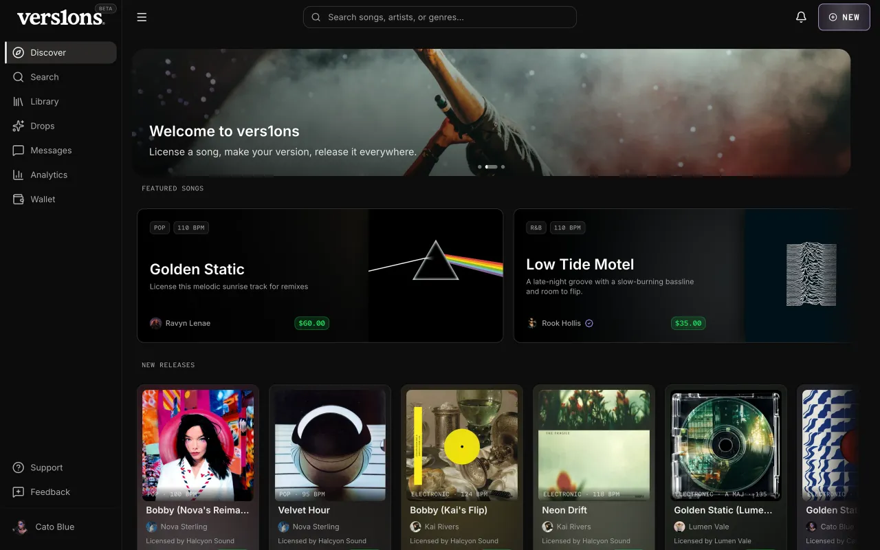
05DiscoverDiscover was where the system first came together. Featured songs sit on a blurred backdrop of their own cover art, and the key, BPM and genre ride on the art itself. While it loads, each placeholder has the shape of the card it becomes, so nothing jumps, and a section with nothing in it doesn't show at all. 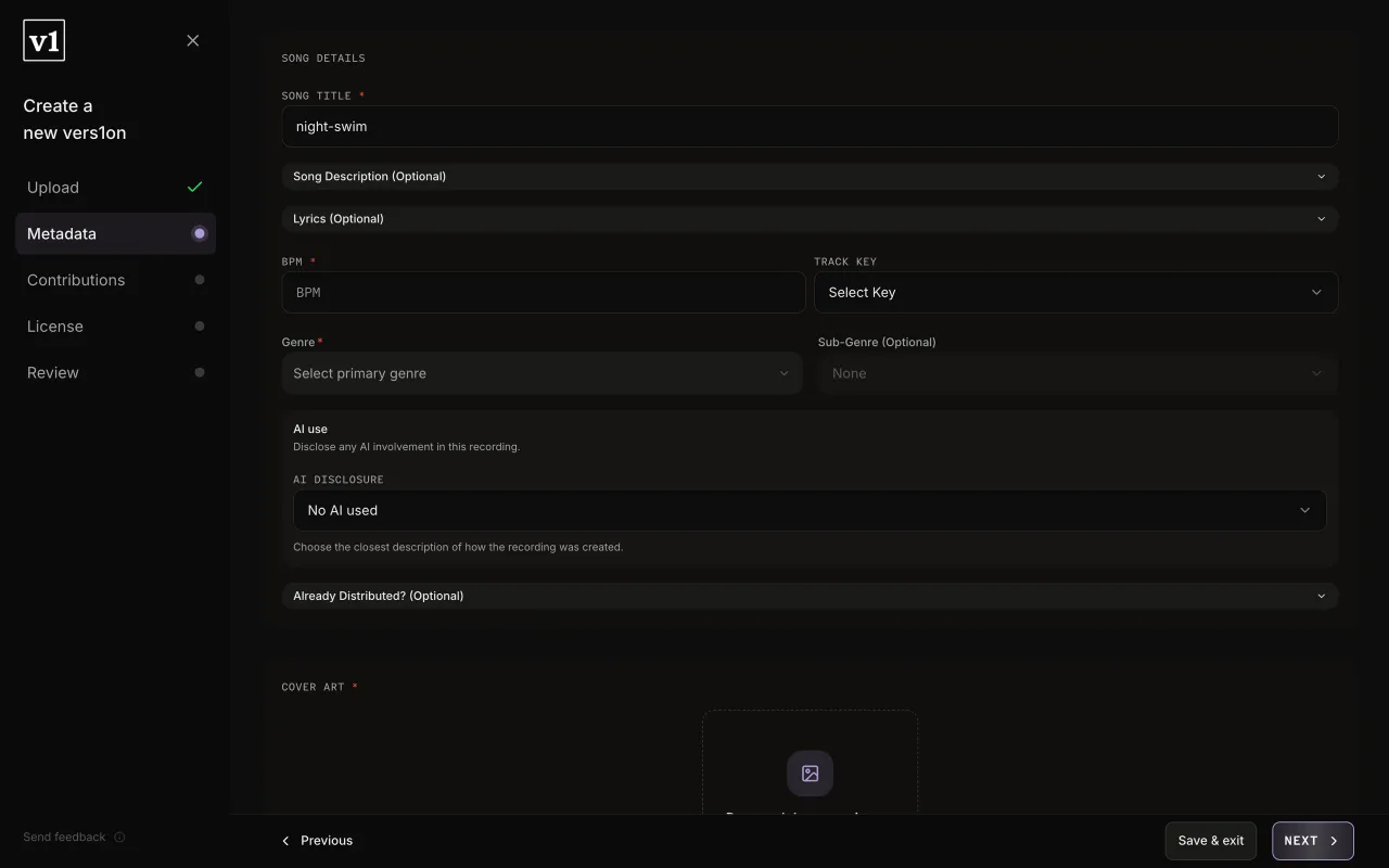
06Wizards on one specThe upload and distribution wizards were built separately and looked it. Now they share one set of step states, done, current, to do and error, plus one footer, one field style and one place to drop files. Going from one to the other feels like the same app. 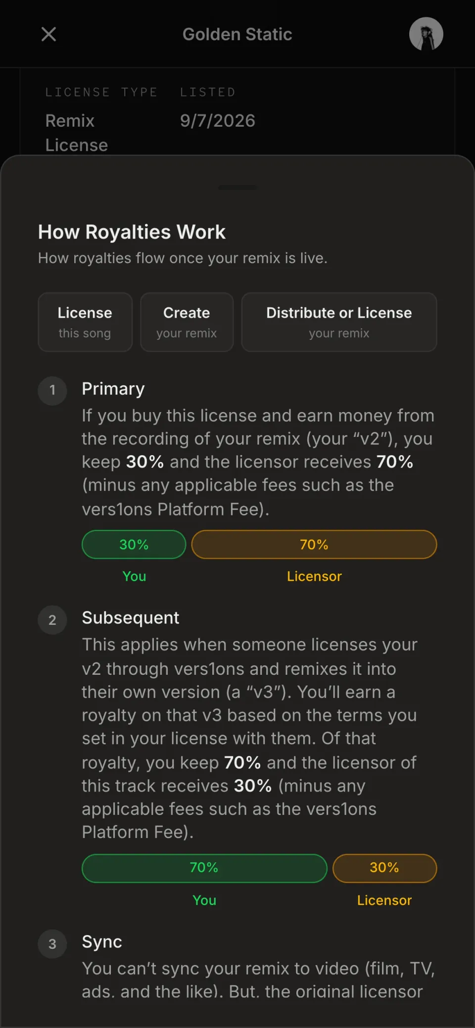
07Built for phonesOn a phone, touch sizes come from the components, not from each screen. Desktop stays exactly as it was while every control on mobile is big enough to tap, sheets replace pop-ups, and inputs are sized so iOS doesn't zoom in when you type. 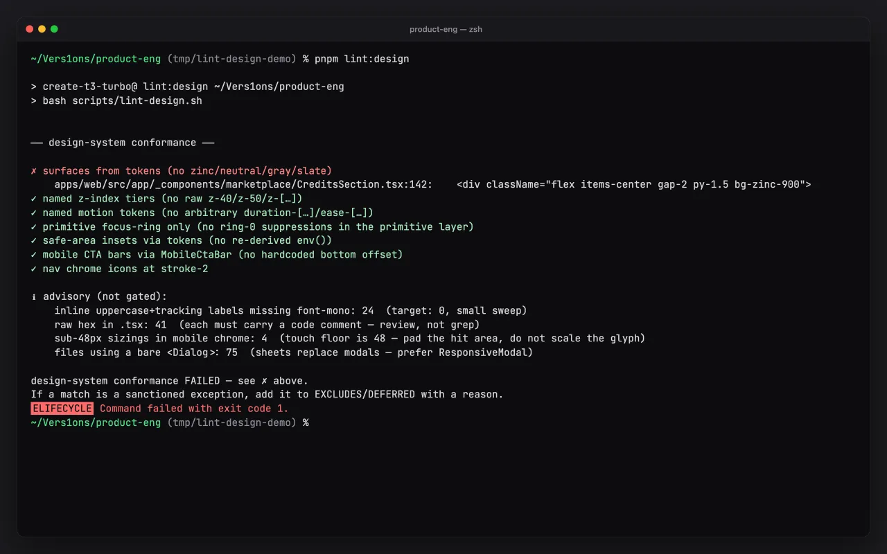
08It holdsA design check runs in CI on every change. It blocks off-system colors, raw layering values and off-token motion, so nothing drifts without a reviewer having to catch it. Rules that a simple check can't judge reliably only warn, because a gate that cries wolf gets ignored.
Mobile design
The same flow on a phone. Click any screen to see it full size.The same flow on a phone. Each screen links to it at full size.
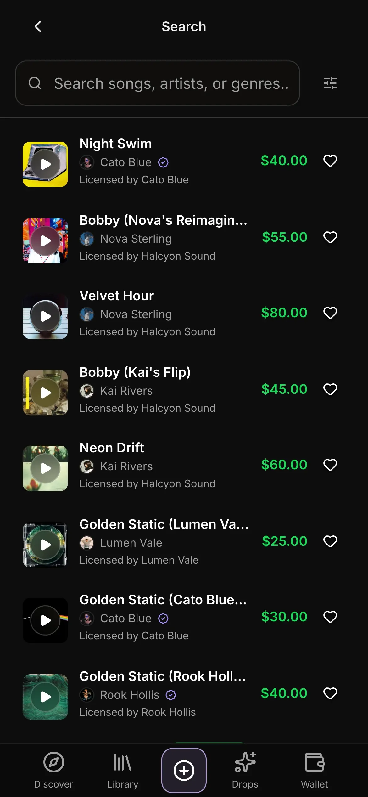 (opens full size)
01The same rows and price as desktop, sized for a thumb. 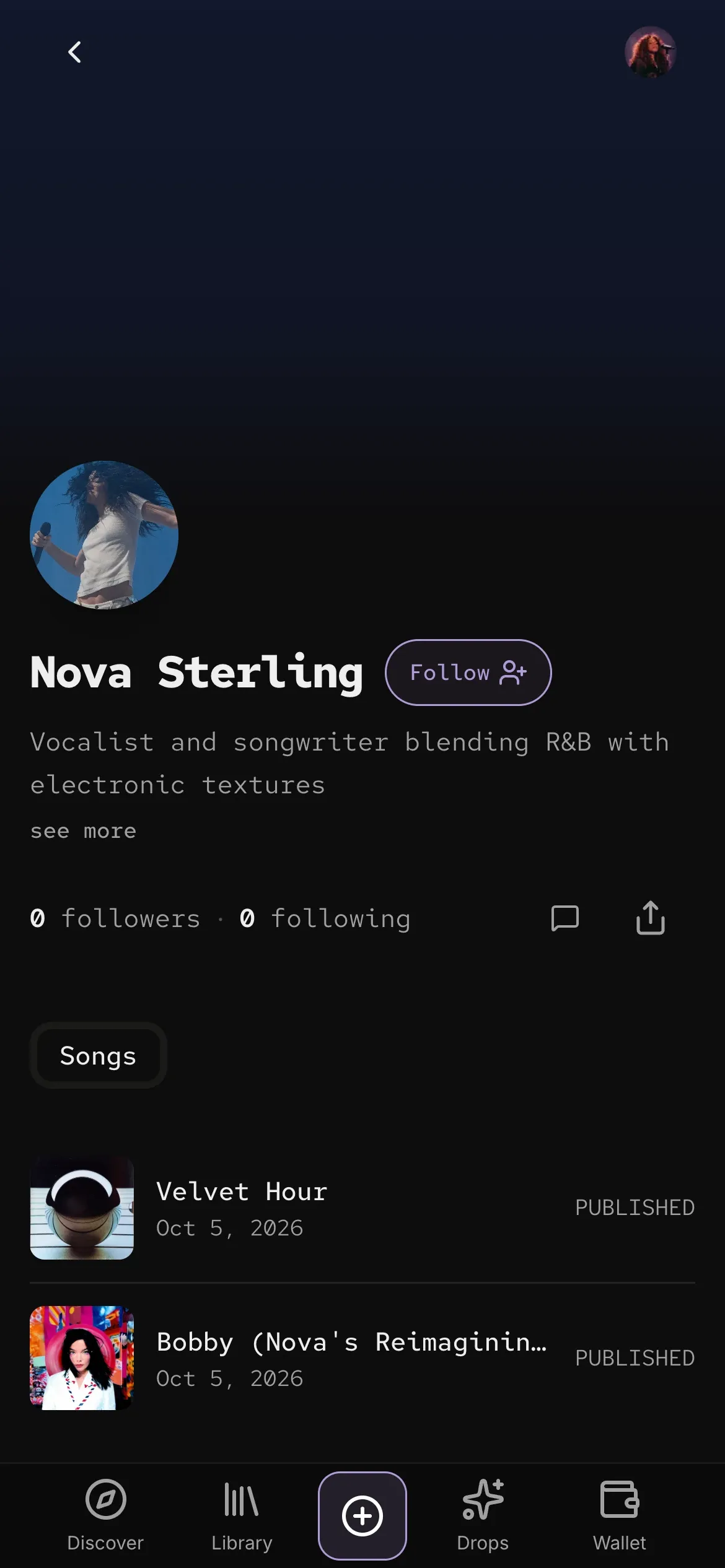 (opens full size)
02An artist, on the same parts as everything else. 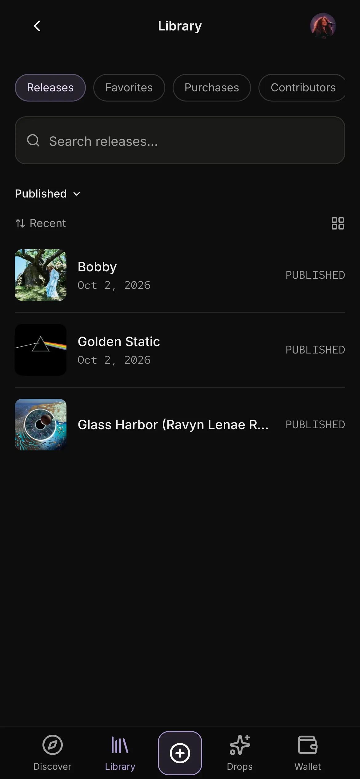 (opens full size)
03Your library, in the same tabs and rows.
What changed, and why
The same part of the product in an early build and today.
Discover
In March, Discover was flat cards on plain black, with monospace on everything and prices in an emerald green of their own. Now featured songs sit on their own cover art, words are in Inter and data in mono, and every card has the same price pill and a "Licensed by" line.
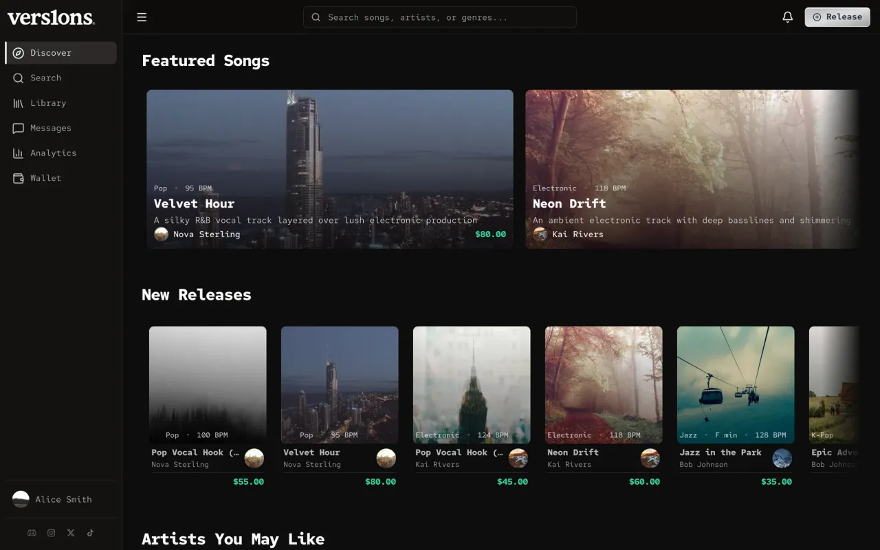
Before · Mar 2026Flat cards, mono everywhere. 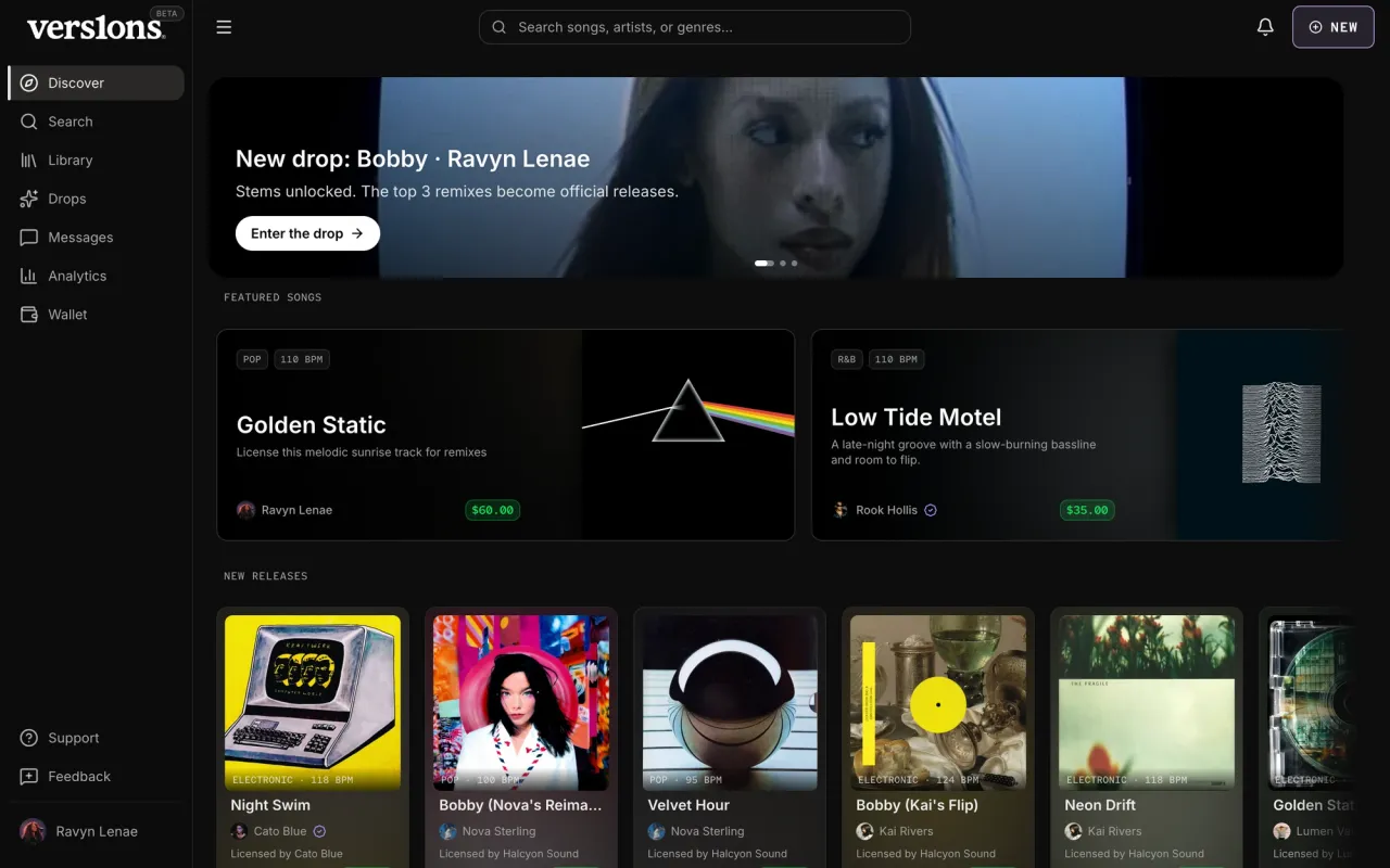
Now · Oct 2026The art leads, one accent. Discover on a phone
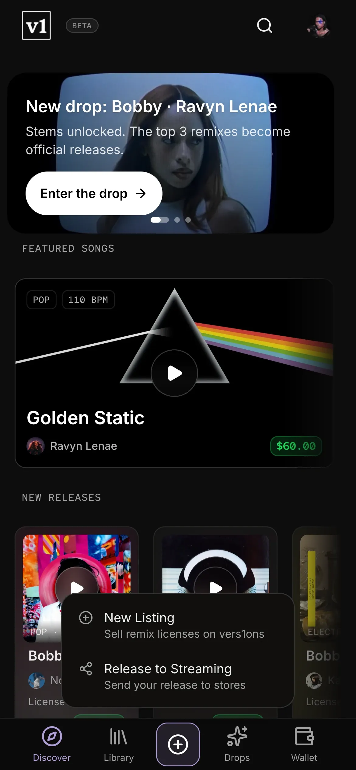
In November, the phone app was the desktop squeezed down, with small caps everywhere, an orange tab underline and two competing buttons at the top. Now there's one lavender accent, a featured poster made for the screen and cards with a clear order. The early seed had no cover art, so its tiles are placeholders.
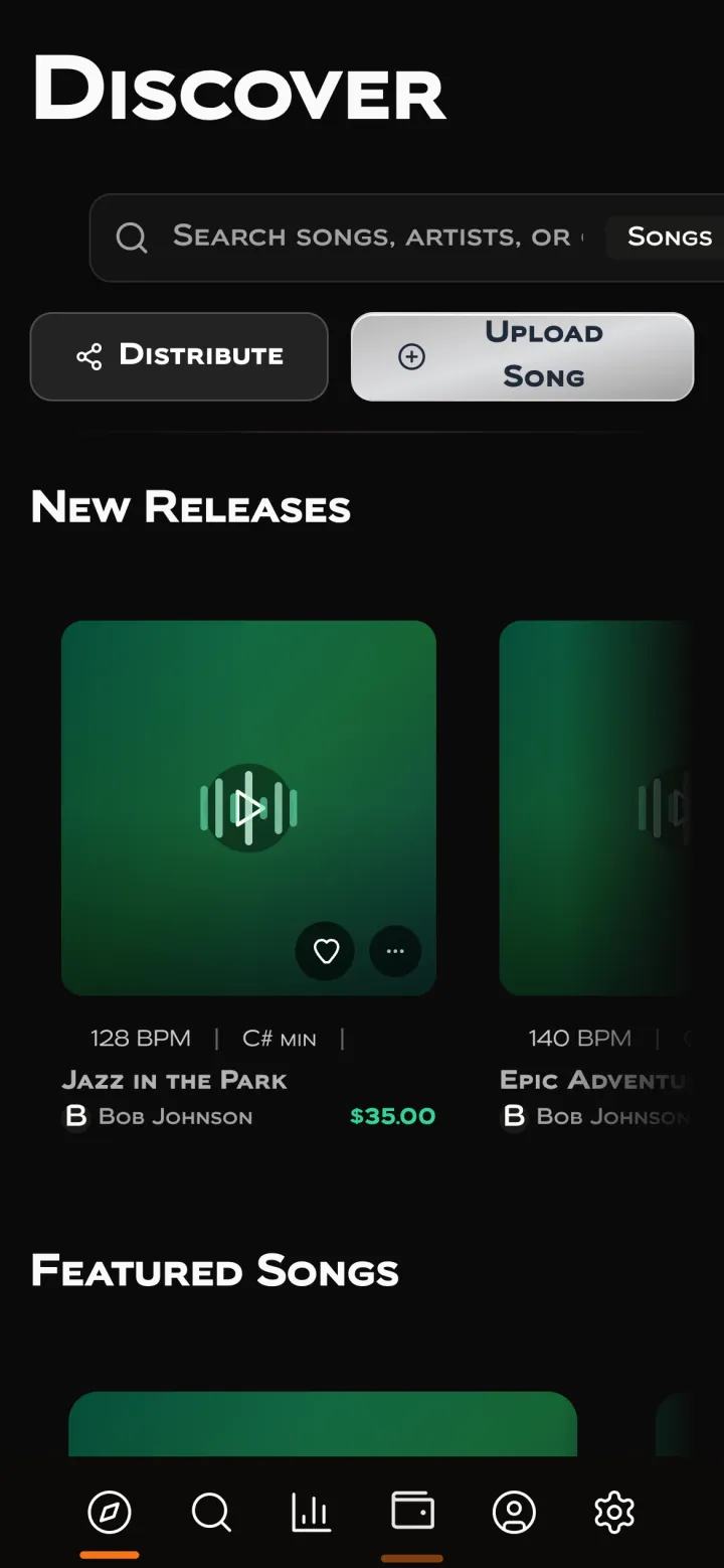
Before · Nov 2025The desktop, squeezed. 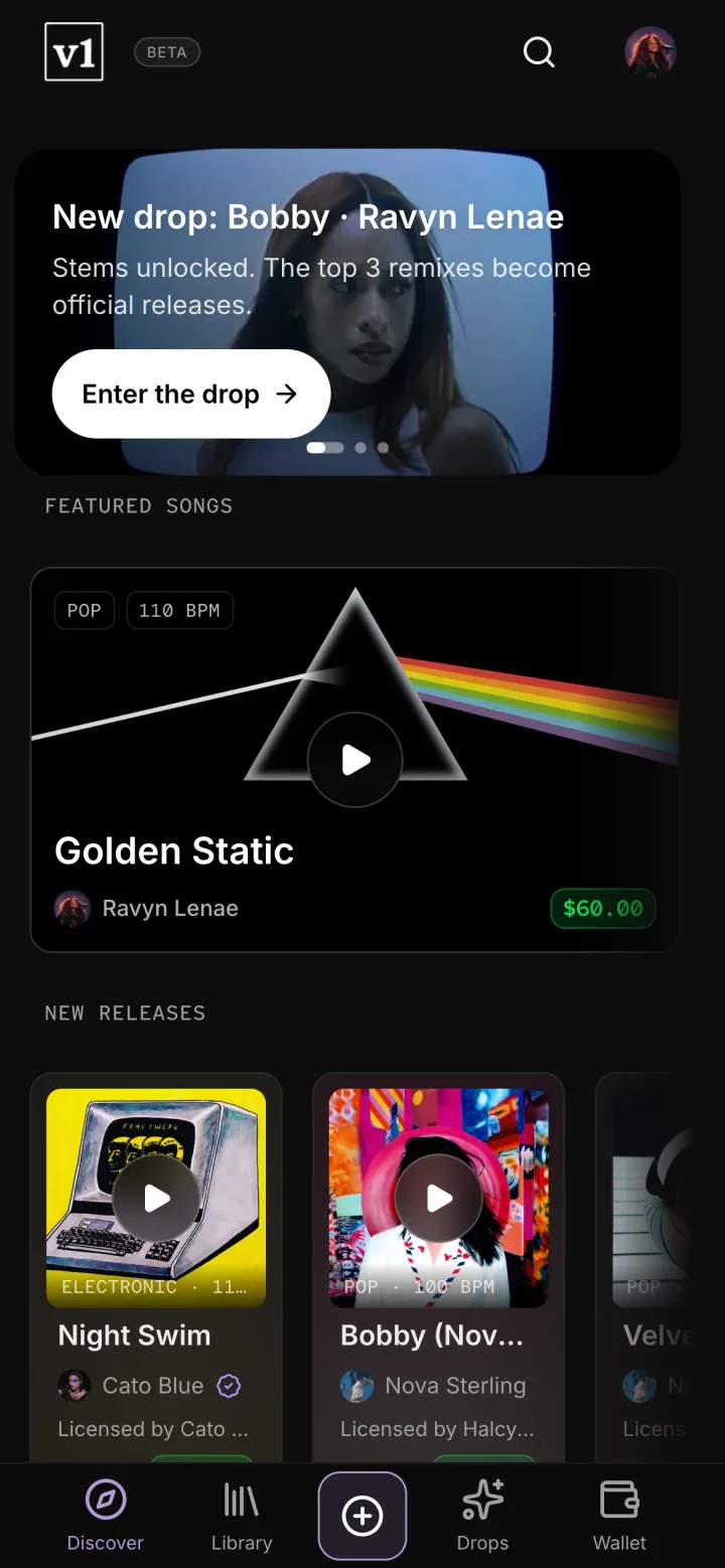
Now · Oct 2026Made for the phone. Search
Search results were a list of rows with filters squeezed into the top bar. Now filters have their own column, every row reads the same way with its data in mono, and the price is the one green thing on the line.
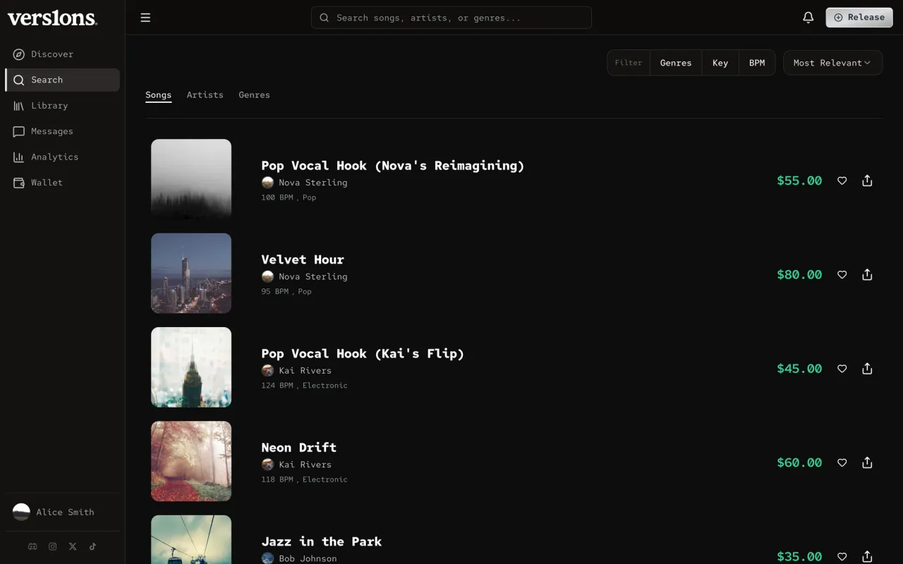
Before · Mar 2026Filters in the top bar. 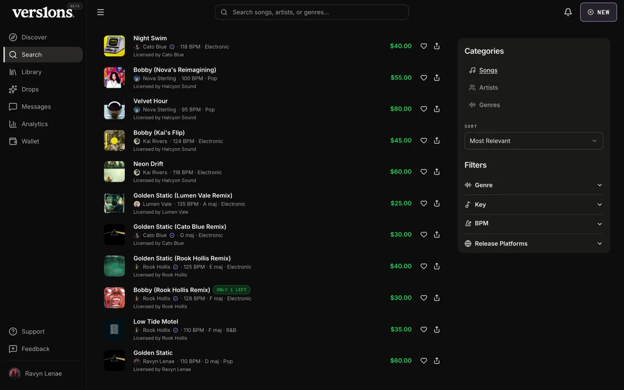
Now · Oct 2026One way to read a row.
Reliability
The rules live in code, so they hold.
Colors, type, spacing, layering and motion all come from tokens, and every screen builds on the same shared components instead of copying them. A check in CI fails any change that uses an off-system color, a raw layering value or off-token motion. Each exception it allows is listed in the check with a reason. Every control has a visible focus ring from its component, and touch sizes on mobile come from the components too, so a new screen gets them for free.
Outcome
vers1ons looks like one product, and it stays that way.
Every surface runs on the same system, from the app and its wizards to the landing page and the smaller apps around it. New screens are put together from parts instead of designed from scratch, and CI keeps them on brand without a reviewer. People noticed. Labels told us it felt like a product they could trust, artists said it looked really good, and investors came back saying everything looked a lot better.